Accessibility
Building WCAG 2.2 AA Compliant Web Applications
WCAG conformance is a property of complete user journeys, not a score from an automated scanner. Native semantics, keyboard behaviour, focus, errors and reflow must survive real application state.
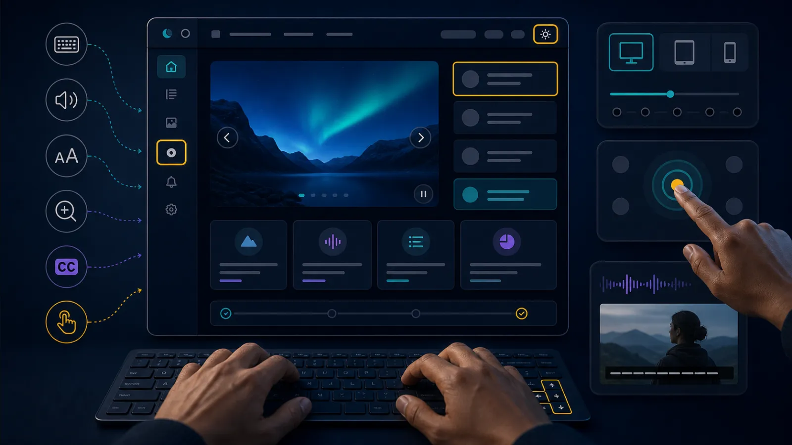
Accessibility is interaction engineering
A page can have perfect colour contrast and still trap keyboard users in a modal, lose focus after validation or announce dynamic content incorrectly. Build accessibility into components, design acceptance and tests. A final audit finds defects when fixes are most expensive.
WCAG 2.2 AA is a measurable baseline, not proof every disabled user can complete the product's workflows. Include people and assistive technology in testing for important journeys.
Prefer native HTML
| Need | Preferred element | Common failure |
|---|---|---|
| Action | button | Clickable div lacks keyboard/semantics |
| Navigation | a href | Button breaks link behaviour |
| Input name | label | Placeholder disappears and is not a label |
| Grouping | fieldset/legend | Related choices lack context |
| Table data | Headers and captions | Visual alignment only |
| Status | Appropriate live region | Every update interrupts speech |
ARIA can add missing semantics; it cannot repair arbitrary behaviour automatically. A custom combobox inherits a specification and extensive keyboard testing.

Keyboard access includes visible focus
Every interactive control must be reachable and operable in a logical order without a pointer. Do not use positive tabindex to patch DOM order. Focus indicators need sufficient visibility and must not be obscured by sticky headers or overlays.
WCAG 2.2 adds criteria around focus appearance/obscuration and target size. Meeting a minimum does not justify tiny dense controls when touch or motor access is central.
Focus management follows context change
After client-side navigation, modal opening, item deletion or validation failure, decide where focus moves and what is announced. A modal traps focus while open, returns it to a sensible trigger and closes with expected keyboard behaviour.
Do not move focus merely because data refreshed. Unexpected focus theft disrupts typing and screen-reader position.
Validation errors need relationships
Identify errors in text, associate them with fields using the accessibility tree and provide an error summary linking to invalid controls. Do not rely on red borders. Preserve user input and move focus to the summary or first error according to a consistent tested pattern.
Server and client validation should produce the same accessible structure. Dynamic errors need an announcement that is informative without repeatedly interrupting input.
Reflow is not desktop shrunk smaller
At 200% zoom and narrow viewport, content should reflow without two-dimensional scrolling except where intrinsically necessary. Fixed heights, clipped text and icon-only controls commonly fail. Test browser zoom, text spacing and 400% equivalent layouts.
Responsive visual reordering must not create a different keyboard and reading sequence from the DOM.
Authentication and time limits need alternatives
Accessible authentication cannot require a cognitive-function test without an alternative or assistance. Support password managers and paste. CAPTCHA requires an accessible route, not merely an audio version that remains difficult.
Warn before session timeout, allow extension and preserve work where security permits. A timeout designed only around server session expiry can erase forms before assistive-technology users finish.
Automation catches a subset
Automated tools find missing names, contrast and structural issues, but cannot judge logical focus, meaningful alt text, error recovery or whether a workflow is understandable. Run them in component tests and CI, then add keyboard, screen reader, zoom and high-contrast/manual checks.
Test with representative content and error states. An empty component demo does not reveal long translations, duplicate IDs or validation behaviour.
Third-party components remain your responsibility
Cookie banners, payment widgets, chat, date pickers and identity pages are part of the journey. Evaluate keyboard and screen-reader behaviour before adoption, pin upgrade tests and provide alternatives when vendors cannot fix blockers.
Production checklist
- Use native elements and semantic landmarks.
- Provide complete keyboard operation and visible focus.
- Keep DOM, visual and reading order coherent.
- Manage focus after genuine context changes.
- Associate labels, hints and errors programmatically.
- Do not rely on colour, position or shape alone.
- Test zoom, reflow, text spacing and high contrast.
- Make authentication and timeouts accessible.
- Include loading, empty, error and success states.
- Combine automation, manual AT testing and user evidence.
WCAG conformance is not the same as usability
A page can technically satisfy individual success criteria while remaining exhausting for people using magnification, voice control or a screen reader. Conformance is a necessary testable floor. The product still needs coherent language, predictable interaction and efficient journeys.
Test complete tasks with different input and output modes, not isolated components. Registration may have accessible fields but fail when a session expires, an error summary loses focus or a third-party payment frame cannot be operated.
Accessibility bugs are often integration bugs. A design-system button may be sound until an application disables focus, changes its name dynamically or places it inside an inaccessible modal.
Names, roles and states form the assistive contract
Every interactive control needs a programmatically determinable name, appropriate role and current state. Visible text should usually supply the name. An aria-label that differs from the visible label can make voice commands fail because users speak what they see.
ARIA changes the accessibility tree, not behaviour. Giving a div role button does not add keyboard activation, focus or disabled semantics. Native elements carry these contracts and browser behaviour with less code.
Dynamic state such as expanded, selected, invalid and busy must update at the right time. Too many live announcements overwhelm users; no announcement leaves asynchronous work invisible.
Focus is application state
Single-page navigation, dialogs and validation can change context without a full page load. Move focus when users need orientation: into an opened modal, to an error summary after failed submission or to the new page heading after client-side navigation.
Restore focus sensibly when temporary UI closes. If the triggering element disappeared, choose the next logical location rather than sending focus to the document start. Never trap focus outside a modal or inside a component the user cannot dismiss.
Visible focus must remain distinguishable against adjacent colours and not be obscured by sticky headers or cookie banners. WCAG 2.2 adds explicit focus appearance and not-obscured concerns that expose many polished but unusable interfaces.
Pointer interactions need equivalent and forgiving routes
Drag-and-drop, hover menus and tiny icon targets create barriers for motor and touch users. Provide click or keyboard alternatives for dragging, keep target sizes and spacing usable and avoid actions triggered merely by crossing a boundary.
Do not depend on hover to reveal essential information; keyboard focus and touch need access too. Tooltips cannot carry instructions required to complete a field because they are difficult to discover and dismiss consistently.
Gesture alternatives should preserve outcome, not mimic motion. Reordering can use Move up and Move down controls; a drawn signature journey may need a suitable alternative according to the legal and business requirement.
Validation should preserve data and explain recovery
Identify errors in text, associate messages with fields and provide an error summary linking to each problem. Colour and an icon alone are insufficient. Avoid clearing valid values after a server-side error or timing users out while they correct it.
Required format should be described before submission. Suggestions help when known, but do not claim an input is invalid when the server or dependency is unavailable. Technical failure and user correction require different messages.
For important legal or financial submissions, allow review, correction or confirmation before irreversible action. Accessible error prevention is also good operational design.
Zoom and reflow reveal layout assumptions
At 400% zoom, a desktop viewport behaves like a narrow mobile view. Content should reflow without two-dimensional scrolling except where its meaning genuinely requires it. Fixed heights, clipped text and controls that overlap are frequent failures.
Tables may need a scrollable labelled region or an alternative summary rather than collapsing cells into ambiguous cards. Preserve relationships and headings. Responsive redesign should not change reading order so visual and DOM sequences disagree.
Text spacing overrides expose components that assume exact line height or width. Test them; users may apply custom styles to read comfortably.
Authentication must not depend on memory puzzles
WCAG 2.2 addresses accessible authentication: users should not be forced to transcribe, remember or solve cognitive function tests without an alternative or assistance. Password managers, paste and passkeys can improve both accessibility and security.
Do not block paste into password or verification fields. If a one-time code is needed, support programmatic autocomplete and clear expiry/retry behaviour. CAPTCHAs need accessible alternatives and remain a usability cost even when alternatives exist.
Session expiry warnings should provide enough time to extend, and re-authentication should preserve entered data where safe. Security controls that force users into insecure workarounds have failed both goals.
Build an evidence-based accessibility process
Automated tools find missing names, contrast issues and structural mistakes, but cannot judge whether focus moves sensibly or instructions make sense. Combine linting, component tests, browser automation, keyboard review, screen-reader checks and testing with disabled users.
Record browser, assistive technology and journey for defects. Severity should reflect blocked outcomes and availability of workarounds, not only the numbered criterion. Prevent recurrence through shared components and regression tests.
Publish an accessibility statement that reflects tested reality, limitations and contact routes. A compliance badge is not evidence; repeatable tests and resolved user barriers are.
Related C3 Software guides
Frequently asked questions
Can automated tools prove WCAG 2.2 AA?
No. They detect a useful subset; interaction, focus, meaning and assistive-technology behaviour need manual testing.
Should custom controls use ARIA?
Only when native HTML cannot express the interaction, with the full keyboard and state pattern implemented.
Is accessibility complete after launch?
No. Content, component and browser changes require regression testing and ongoing ownership.
Does WCAG AA guarantee usability?
No. It is a strong baseline; important journeys also need usability evidence from disabled people.
Build accessibility into delivery
For a WCAG-focused application review, talk to C3 Software.